
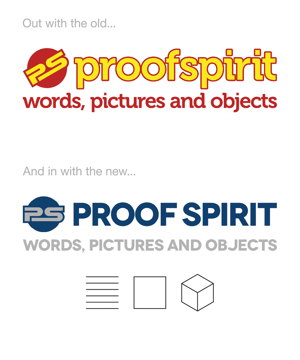
 Time to ring the changes with a new brand identity for PROOF SPIRIT. Although I was fond of the old logotype, in Museo, I’ve been looking at alternatives recently and really like the new face, Novecento. It has a classic, yet modern look – clean and unfussy. Whilst I originally went for primary colours, I also decided that a more sober, ‘grown-up’ look was in order.
I’ve had the idea for a simple graphic logo to represent ‘Words, Pictures and Objects’ kicking around my head for a while and have been playing around with several versions, eventually deciding to simplify and strip it back to the very essence of one, two and three dimensions – line, square and cube. A single line didn’t quite work, whereas the set of lines (to depict writing on a page) gives a more balanced pictorial pattern.
So there you have it. New year, new typeface, new logo and even a new post. I’ll be upgrading the whole website in the coming weeks to improve the look and feel and to better represent and showcase my work.
New year’s resolutions? 300dpi for print and 72dpi for screen…
Discussion
No comments yet.